
Trended Lab Results Are a Must!
What are trended lab results?
Trended lab results are simply showing a visual representation of your blood test results over time, usually in a dot chart format where time is plotted on the X-axis (horizontal) and your scores are plotted on the Y-axis (vertical).
Trended views are hands-down the best way to view your blood test scores over time so that you can quickly observe trends and make lifestyle changes before you notice health changes. It’s really the only way to stay on top of your health.
Why aren’t all lab results trended?
They should be.
But, it’s just a time-consuming task. You or your healthcare provider would have to organize all of your lab reports over time and plot results in an easy-to-understand chart. It is rare to find a healthcare provider or an individual doing this on his own. Even some of the most commonly used electronic health records systems do not store and report lab test data this way. So unfortunate!
When “normal” isn’t good enough
The typical way that lab test results are reported is simply to specify whether your result was “normal” or “abnormal” and then also state detailed ranges of “normal.”
Most likely, if you have ever had a wellness blood test (e.g., cholesterol, blood sugar, and more), then you have followed up afterward with your doctor and heard that your test results were either “normal” or “abnormal.” You might have even reviewed your own lab report—alone or with your healthcare provider—and been able to interpret that you either do or don’t fall within “normal” ranges. But those “normal” ranges, for many blood tests, are very wide and report averages. The “normal” range may or may not be healthy for you.
The “normal” range may or may not be healthy for you.
Because the normal ranges are generally broad, you could still see that your result is “normal,” but you are just barely in the window of normal. This might be a big change for you and it could indicate an impending health problem. Wouldn’t you like to catch a change in your health when it’s just on paper and not yet impacting your health? Trended views let you do just that.
What to look for in your trended report
The beauty of trended reporting is that it is visually obvious when your health is headed in the right or wrong direction. The chart does all of the hard work for you, and you don’t have to guess at how healthy you are or flip back through files to try to find old reports for comparison.
Some warning signs that your health is at risk and you should follow-up with your healthcare provider:
- Sudden jump into a high risk health range
- Consistent climb toward a higher risk health range
- Sudden change in score
- Lack of change in score over time when attempting to improve
What if your healthcare provider doesn’t show your results as trends?
Not all healthcare providers have the time or technology to report your results as trends. Bloodscore automatically plots your results over time and alerts you as you move into higher risk health ranges.
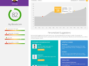
Bloodscore Dashboard: results and health history as a historical trend
If you are not a Bloodscore Member, you can track your own results over time and build your own chart. It takes some time to set it up for the first time, but then it’s quicker to update over time.
How often should I test my blood?
Trended reports are, of course, more meaningful if you have more results to compare over time. We recommend testing every 90 days if you are serious about taking control of your health and finding the lifestyle changes that improve your health.